Responsive Menus with TailwindCSS

A menubar with dynamic icons and no Javascript using exclusively TailwindCSS.
web
css
guide
Author
Affiliation

miah0x41

Published

May 26, 2024

Modified

June 25, 2024

Responsive Web Page Layout Illustration

TailwindCSS is a utility-first Cascading Style Sheet (CSS) framework that allows you to build responsive web pages quickly. In this guide, we will build a responsive menubar with dynamic icons and no Javascript using exclusively TailwindCSS.

Some of the top YouTube videos with more than 300k combined views on the subject [1], [2], [3] all use Javascript. Examples from five years ago [4] use custom CSS most likely as they are based on TailwindCSS versions 1 or 2. One alternative is to use a component framework like DaisyUI that provides a set of pre-built components including a NavBar [5].

This guide will use TailwindCSS version v.3.4.3 including the peer-* and group-* classes to bypass the need for both Javascript to change the menu icon as well as triggering the menu itself in mobile view as illustrated below:
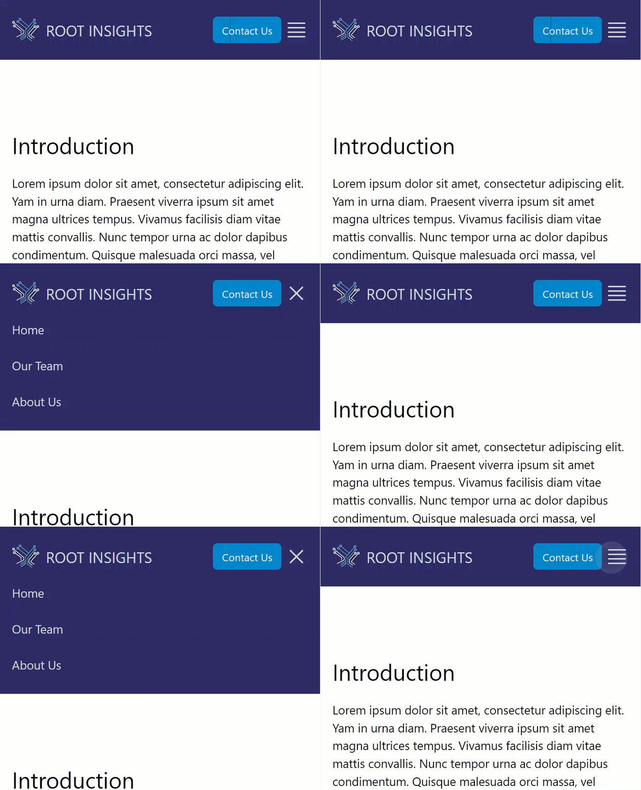
Fully Responsive Menu with Dynamic Icons

These are the concepts that were used to produce the end result:

  1. A checkbox and the peer-checked class to trigger and record the state of the menu.
  2. The for attribute of the label tag to provide an alternative target to activate the checkbox.
  3. The group-* classes to change the mobile menu icon.
Video Guide

The post is the basis for a video guide on this topic called: Responsive Menus with TailwindCSS and available on YouTube.

Page Structure

The following HyperText Markup Language (HTML) document will be the focus of the tutorial and contains some example content:

index.html
1<!doctype html>
2<html lang="en">
  <head>
3    <meta charset="UTF-8" />
4    <meta name="viewport" content="width=device-width, initial-scale=1.0" />

    <title>Tailwind CSS Responsive Menu</title>

    <!-- Tailwind CSS CDN -->
5    <script src="https://cdn.tailwindcss.com"></script>

  </head>

  <body></body>

</html>
1
The !DOCTYPE is mandatory for HTML and ensures browsers parse the document correctly [6].
2
The <html> tag with a two letter language code.
3
The charset in the <meta> element defines the encoding for the source file.
4
This line is used to reset the behaviour of mobile browsers which automatically scale desktop sites. This line ensures no such scaling occurs as we will manage the mobile experience directly [7].
5
For demo purposes the TailwindCSS library using a Content Delivery Network (CDN) script from the Tailwind Get Started guide.
index.html
<!doctype html>
<html lang="en">
  <head>
  </head>

  <body>
    <!-- Focus of Tutorial -->
6    <header></header>

    <!-- Example Content -->
7    <main class="container mx-auto mt-20 p-4">
      <h1 class="text-3xl mb-5">Introduction</h1>

      <p>
        Lorem ipsum dolor sit amet, consectetur adipiscing elit. Yam in urna
        diam. Praesent viverra ipsum sit amet magna ultrices tempus. Vivamus
        facilisis diam vitae mattis convallis. Nunc tempor urna ac dolor dapibus
        condimentum. Quisque malesuada orci massa, vel suscipit nisi accumsan
        et. Curabitur ornare ante commodo faucibus euismod. Vestibulum nunc
        urna, auctor eget suscipit eget, tempus nec erat. Donec fermentum
        egestas magna ut egestas. Nunc urna justo, pulvinar at mollis at,
        interdum nec sem. Sed ac augue purus. In vitae luctus magna. Maecenas eu
        est ex. Cras bibendum pellentesque mattis. Curabitur lobortis, orci eget
        commodo scelerisque, nisi massa semper tellus, id vehicula lorem neque a
        ipsum.
      </p>
    </main>
  </body>
</html>
6
The focus of the tutorial is a responsive menu residing within this <header> tag.
7
Example content to provide a meaningful environment to develop the menu. When rendered the page currently looks like this:

Example Web Page

Desktop Menu

Basic Structure

The following HTML structures shows the layout of the menu, which consists of a logo, a Call To Action (CTA) button and three links. To make things easier to follow the bg-[#2C2B66] custom class sets the background to a darkblue and the text to a light gray. The logo uses a Scalable Vector Graphics (SVG) format [8], which means it can scale as required and useful for particularly high resolution screens. This can be substituted with a JPEG [9], PNG [10] or even a WebP [11] format bitmap image.

<!-- Focus of Tutorial -->
1<header class="bg-[#2C2B66] text-gray-300">

2  <!-- Logo -->
  <div class="">
    <a href="/" class="">
      <img
        src="ri-symbol-only-white.svg"
        alt="Root Insights Logo"
        class=""
      />
      <span class="">Root Insights</span>
    </a>
  </div>

3  <!-- Menu -->
  <div class="">
    <nav>
      <ul class="">
        <li>
          <a class="" href="/">Home</a>
        </li>
        <li>
          <a class="" href="/our_team">Our Team</a>
        </li>
        <li>
          <a class="" href="/about_us">About Us</a>
        </li>
      </ul>
    </nav>
  </div>

4  <!-- CTA Button -->
  <a href="#contact-us" class="">
    <button class="">Contact Us</button>
  </a>

</header>
1
Basic styles to make the menu visible initially.
2
The logo
3
The links to other pages or Menu
4
A Call To Action button

The rendered page (as its lacking any layout definition) looks like a stacked list:

Initial menu layout

Flexbox Layout

The next step is to layout the menu items suitable for a desktop environment, make the <button> stand out and add whitespace to help distinguish the elements:

Use of flexbox to layout menu

The primary method is the use of the flex class, which by default uses a flex-row layout and has been added deliberately to make that explicit:

<!-- Focus of Tutorial -->
1<header class="bg-[#2C2B66] text-gray-300 flex flex-row items-center p-4">

<!-- ... -->

</header>
1
The flex-row class is the default and helps contextualise the items-center class as aligning the middle of the descendant elements. The padding of p-4 is used to provide some spacing around the edges of the the <header> element.
  <!-- Logo -->
2  <div class="flex-1">
3    <a href="/" class="flex flex-row items-center gap-2 py-2">
      <img
        src="ri-symbol-only-white.svg"
        alt="Root Insights Logo"
4        class="h-10"
      />
      <span class="">Root Insights</span>
    </a>
  </div>
2
The class flex-1 ensures that this element consumes all the remaining space relative to it’s peers. In effect squashing the menu of links and the button to the right-hand-side.
3
The two descendants of the <a> tag are positioned using flex flex-row, vertically centered using items-center and have both internal spacing with gap-2 and vertical padding with py-2.
4
The image height is set to h-10.
  <!-- Menu -->
  <div class="">
    <nav>
5      <ul class="flex flex-row items-center justify-between gap-4 p-4">
        <li>
          <a class="" href="/">Home</a>
        </li>
        <li>
          <a class="" href="/our_team">Our Team</a>
        </li>
        <li>
          <a class="" href="/about_us">About Us</a>
        </li>
      </ul>
    </nav>
  </div>
5
The list (<ul>) is laid out horizontally using flex flex-row, vertically centered using items-center, and has space between the items using justify-between. The padding of p-4 is used to provide some spacing around the edges of the the <ul> element, whilst gap-4 does the same between the elements.
  <!-- CTA Button -->
  <a
    href="#contact-us"
6    class="bg-sky-600 px-3 py-2 font-medium text-gray-200 rounded-md hover:text-white hover:bg-sky-500"
  >
    <button class="">Contact Us</button>
  </a>
6
The button is styled with padding px-3 py-2, a medium font weight font-medium, light gray text text-gray-200, rounded corners rounded-md, a sky blue background bg-sky-600, and changes colour on hover hover:text-white hover:bg-sky-500.

Desktop Menu Polish

The first enhancement is a dynamic response to a :hover action for the logo. We utilise the group class for the <div>, which means the behaviour of the descendants can be coupled. In this example, hovering over either the image or the text causes both sets of :hover actions to be triggered:

Dynamic Logo Hover

This is achieved in practice using a combination of group and group-hover:

    <!-- Focus of Tutorial -->
    <header class="bg-[#2C2B66] text-gray-300 flex flex-row items-center p-4">

      <!-- Logo -->
      <div class="flex-1">
1        <a href="/" class="flex flex-row items-center gap-2 py-2 group">
          <img
            src="ri-symbol-only-white.svg"
            alt="Root Insights Logo"
2            class="h-10 group-hover:scale-105"
          />
          <span
3            class="uppercase text-2xl font-medium group-hover:text-white group-hover:underline group-hover:underline-offset-4"
            >Root Insights</span
          >
        </a>
      </div>

    </header>
1
Added the group class to the surrounding <a> tag.
2
Added a :hover effect for a group of descendant elements that scales the image up by 5% using scale-105.
3
Added a set of text-transforms and hover effects such as underline.

For the menu links a set of :hover effects:

        <li>
          <a
4            class="hover:text-white hover:underline hover:underline-offset-4"
            href="/"
          >
            Home
          </a>
        </li>
4
Two :hover effects: a change in text colour to white and an underline with an offset of 4 pixels.

Mobile Menu

The desktop menu now looks reasonable so the focus is on the mobile menu. Currently, using Mozilla FireFox’s Developer Tools the current simulated view on a phone such as the Apple iPhone 13 Pro Max is:

Mobile View of the Current Menu

Re-sizing the Logo and Button

There a number of issues to address prior to the creation of the mobile menu:

  • The Root Insights logo and text is too large.
  • The <button> text wraps and the button itself is too large.

Temporarily hiding the menu with the hidden class and adjusting the logo and button size:

      <!-- Logo -->
      <div class="flex-1">
        <a href="/" class="flex flex-row items-center gap-2 py-2 group">
          <img
            src="ri-symbol-only-white.svg"
            alt="Root Insights Logo"
1            class="h-8 md:h-10 group-hover:scale-105"
          />
          <span
2            class="uppercase text-xl md:text-2xl font-medium group-hover:text-white group-hover:underline group-hover:underline-offset-4"
            >Root Insights</span
          >
        </a>
      </div>


      <!-- CTA Button -->
      <a
        href="#contact-us"
3        class="text-sm md:text-base px-3 py-2 font-medium text-gray-200 rounded-md bg-sky-600 hover:text-white hover:bg-sky-500"
      >
        <button class="">Contact Us</button>
      </a>
1
The medium breakpoint is used to preserve the desktop menu logo height to md:h-10 and as TailwindCSS is mobile-first the mobile logo height is set to h-8.
2
The text size is reduced from text-2xl at the medium breakpoint to text-xl.
3
The button text size is reduced from text-base to text-sm.

Without the menu links the rest of header looks like this:

Mobile Menu with Logo and Button

Checkbox Trigger

To trigger the mobile menu and record it’s state we’re going to use an <input> element of type checkbox after the <button>:

      <!-- CTA Button -->
      <a
        href="#contact-us"
        class="text-sm md:text-base px-3 py-2 font-medium text-gray-200 rounded-md bg-sky-600 hover:text-white hover:bg-sky-500"
      >
        <button class="">Contact Us</button>
      </a>

      <!-- Checkbox -->
      <input class="" type="checkbox" id="menu-toggle" />

This adds a checkbox to the right of the Call To Action button:

Checkbox to the right of the button

To have the menu appear dynamically when the checkbox is activated, we’re going to use the peer-* set of classes. The concept is illustrated in the documentation. The element we want to react to has the peer class assigned, in this case the checkbox. For subsequent sibling or peer elements we can use the peer-* states to provide a dynamic output:

      <!-- Checkbox -->
1      <input class="peer" type="checkbox" id="menu-toggle" />

      <!-- Menu -->
2      <div class="w-full md:w-auto hidden peer-checked:block md:block">
        <nav>
          <ul
            class="md:flex flex-row items-center justify-between gap-4 md:p-4"
          >
1
The peer class is added to the <input> element.
2
The peer-checked class is used to display the menu when the checkbox is checked. The default display is changed to hidden and changed to block also at the medium breakpoint.

The result is a menu that appears when the checkbox is checked:

Dynamic Mobile Menu with Checkbox

Animating the Menu

One of the limitations of changing the CSS display attribute is that it cannot be animated. An alternative is to the use the height property as follows:

      <!-- Menu -->
      <div class="w-full md:w-auto h-0 peer-checked:h-36">

The code snippet shows a default height of h-0 and a height of h-36 when the menu is activated via peer-checked. By speciifying the height it creates a problem with the link text as follows:

Overflowing Link Text

This is mitigated with the overflow-hidden as illustrated below:

      <!-- Menu -->
      <div
        class="w-full md:w-auto h-0 peer-checked:h-36 overflow-hidden transition-all duration-300 delay-150"
      >

In addition to the overflow class, three animation settings have been added as well leading to the final working dynamic mobile menu:

Dynamic Mobile Menu with Animation

The vertical black line/artifact is due to the browser zoom level at 133% and not a feature at other zoom levels on FireFox.

Desktop Menu Fixes

Restoring the default viewport shows a number of issues with the menu system:

Desktop Menu with Issues

A number of steps are required:

  1. Hide the mobile menu icons.
  2. Display the menu links (again) by restoring the height.
      <!-- Mobile Menu Button -->
1      <label for="menu-toggle" class="cursor-pointer ml-1 group md:hidden">

      <!-- ... -->

      <!-- Menu -->
      <div
2        class="w-full md:w-auto h-0 md:h-auto peer-checked:h-36 overflow-hidden transition-all duration-300 delay-150"
      >
1
The md:hidden class is used to hide the mobile menu icons on desktop at the medium breakpoint.
2
The md:h-auto class is used to restore the height of the menu links at the medium breakpoint.

This restores the menu to its original state but with the button in the wrong position:

Desktop Menu Restored but with Incorrect Button Position

To change the order of elements relative to the Document Object Model (DOM) use the order-* classes:

      <!-- CTA Button -->
      <a
        href="#contact-us"
        class="text-sm md:text-base px-3 py-2 font-medium text-gray-200 rounded-md bg-sky-600 hover:text-white hover:bg-sky-500 md:order-2"
      >
        <button class="">Contact Us</button>
      </a>

      <!-- ... -->

      <!-- Menu -->
      <div
class="w-full md:w-auto h-0 md:h-auto peer-checked:h-36 overflow-hidden transition-all duration-300 delay-150 md:order-1"
      >

Leaving a full restored menu that is also responsive:

Responsive Menu

Conclusion

This guide has demonstrated how to build a responsive menu with dynamic icons and no Javascript using exclusively TailwindCSS. The key concepts demonstrated were using a checkbox and the peer-* classes to trigger and record the state of the menu. The for attribute of the label tag was used to provide an alternative target to activate the checkbox. When combined with the group-* classes, this provided a dynamic menu system where the icons changed based on the menu state.

Attribution

Profile images based on:

Back to top

References

[1]
Code A Program, “How to make a responsive navbar with tailwind css tailwind css tutorial.” Dec. 2021. Available: https://www.youtube.com/watch?v=X6CsbhSVUEc. [Accessed: May 21, 2024]
[2]
DigitalOcean, “Building Tailwind CSS Navbars - Responsive Too!” May 2022. Available: https://www.youtube.com/watch?v=miiPsBlqMns. [Accessed: May 21, 2024]
[3]
Code A Program, “How to make a responsive navbar with tailwind css tailwind css tutorial #tailwindcss.” Dec. 2022. Available: https://www.youtube.com/watch?v=vYowvsUiChs. [Accessed: May 21, 2024]
[4]
Andy Leverenz, GitHub - justalever/tailwind-navbar: A completely responsive CSS-only navbar using Tailwind CSS.” Sep. 2020. Available: https://github.com/justalever/tailwind-navbar. [Accessed: May 21, 2024]
[5]
“Tailwind Navbar ComponentTailwind CSS Components ( version 4 update is here ).” Available: https://daisyui.com/. [Accessed: May 21, 2024]
[6]
Mozilla Contributors, “Doctype - MDN Web Docs Glossary: Definitions of Web-related terms MDN.” May 2024. Available: https://developer.mozilla.org/en-US/docs/Glossary/Doctype. [Accessed: May 21, 2024]
[7]
Mozilla Contributors, “Viewport meta tag - HTML: HyperText Markup Language MDN.” Oct. 2023. Available: https://developer.mozilla.org/en-US/docs/Web/HTML/Viewport_meta_tag. [Accessed: May 21, 2024]
[8]
Mozilla Contributors, SVG: Scalable Vector Graphics MDN.” May 2024. Available: https://developer.mozilla.org/en-US/docs/Web/SVG. [Accessed: May 21, 2024]
[9]
Mozilla Contributors, JPEG - MDN Web Docs Glossary: Definitions of Web-related terms MDN.” Jun. 2023. Available: https://developer.mozilla.org/en-US/docs/Glossary/JPEG. [Accessed: May 21, 2024]
[10]
Mozilla Contributors, PNG - MDN Web Docs Glossary: Definitions of Web-related terms MDN.” Jun. 2023. Available: https://developer.mozilla.org/en-US/docs/Glossary/PNG. [Accessed: May 21, 2024]
[11]
Mozilla Contributors, WebP - MDN Web Docs Glossary: Definitions of Web-related terms MDN.” Jun. 2023. Available: https://developer.mozilla.org/en-US/docs/Glossary/WebP. [Accessed: May 21, 2024]
[12]
Mozilla Contributors, \(<\)Label\(>\): The Label element - HTML: HyperText Markup Language MDN.” Feb. 2024. Available: https://developer.mozilla.org/en-US/docs/Web/HTML/Element/label. [Accessed: May 26, 2024]

Citation

BibTeX citation:
@online{2024,
  author = {, miah0x41},
  title = {Responsive {Menus} with {TailwindCSS}},
  date = {2024-05-26},
  url = {https://blog.curiodata.pro/posts/05-tailwind-menu},
  langid = {en}
}
For attribution, please cite this work as:
miah0x41., “Responsive Menus with TailwindCSS,” May 26, 2024. Available: https://blog.curiodata.pro/posts/05-tailwind-menu